 We design a new, single page, calendar every year. Our clients like the full year at a glance and the handy size for their desk top or wall. Generally, we try to create a different theme for each year and/or tie the design of the calendar into the design of our brochure or other marketing materials. This year we used an environmental look for our brochure that featured a sunrise, blue skies and a field of flowers. We planned on using the same theme for our 2012 calendar, but none of the designs we came up with met with any enthusiasm from our marketing team. Earlier, Mike had made a suggestion that we try a "vintage" press room look for our Holiday card using cross hatch illustrations. The card had a lot of possibilities and was fun to develop. Why not do the same thing for the calendar? Besides, this theme is evocative of the role of printing in the American Revolution, a history in which our industry takes some pride.
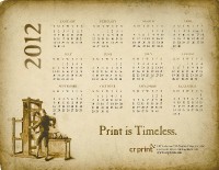
 But this would be a major departure from past designs. The calendar was always a colorful piece that people liked to put up on their wall. A vintage style calendar would lack color and look, well, old. Would it work? And what message could we put on the calendar? Last year's calendar carried the message that "Print Keeps Things Personal." We wanted to convey some of the subtle advantages of a printed message over an e-message. How could the "vintage" look do that? Mike provided the answer. "Print is not just more personal," he said, "print is timeless."
That was the clincher. We determined to make the calendar look like an old, historic, document that has survived the ages. We chose a font called Caslon Antique that has a slightly distressed look. We used Sundance Felt cover stock (the color is called "natural white") to provide texture and printed an aged, or distressed, background image behind the calendar and on the reverse side. Although it appears brown, it is actually printed in process color. The combination of yellow, red and a touch of blue ink, printed over the yellowish Sundance stock gives it that vintage look.
One thing we did not count on was how it might look as an online image. Seen online, it looks like an old document that has been scanned. It is not all that interesting or inviting online. Something of the "Timeless" theme is lost when you are not actually holding a document in your hands. Maybe that is as it should be. People who pick up the calendar invariably get a smile on their face. They turn it over to look at the back side. They are holding a year 2012 calendar that looks like it was printed two hundred years ago. That is what we were trying to achieve - an illustration of the power of print.